A Comprehensive Branding Guide For Business
The most recognized brands in the world use consistency of design to imprint their symbols and marks on our consciousness. By doggedly ensuring that their logo must be presented a certain way or that their exact colors must not be copied in that same composition by anyone else, world-famous brands protect their visual identities.
When you go to a grocery store, for example, and are immediately able to distinguish between Coke and Pepsi, it’s due to the consistency with which these brands have demonstrated their outward expression to the world.

Maintaining that high standard of consistency is not achieved by default. A handy guide called a branding guide or a style guide is always used to keep brand expression consistent and professional. A lot of effort, care, and education goes into creating a brand’s style guide, and the work is never complete.
As the brand grows or changes or as new advertising or media platforms emerge, the style guide responds to that by adding/modifying brand identity rules to ensure a flawless and unvarying representation of the brand to the world.
If you are preparing to start the work on your own branding guide, use this article as a template to help you with architectural rules that apply to your brand.
What is a brand guide?
A brand guide is a compilation of rules and standards that outline how your brand should be presented to the world. It works as a central reference point for all teams, within and outside the brand, to ensure that your brand is represented correctly and consistently at all times.
It enables all the stakeholders of the brand — creators and partners, alike — to understand what a brand is, what it does, and what it stands for.
The essentials of a brand guide
Though a brand guide can be as detailed or as specific as you want, it usually depends on the scope of the brand or its branding or marketing needs + wishes.
For example, the 1976 NASA Graphics Standard Manual is a mammoth document of 220 pages. In contrast, Love to Ride’s brand book is a delightful bonanza of colorful graphics of only 28 pages, with very little text.
Still, for a brand guide to be comprehensive, it must cover these 6 parts of the brand.
Later, as your brand evolves, you can make your brand guide more elaborate or shrink it further. Remember to treat it as a living, breathing creature — regularly updating it in tandem with your brand’s changing needs to keep your brand identity consistent and professional throughout.
How to create an effective brand guide?
Start at the very beginning. Talk about your brand story — your vision and values. And then use those to solidify the reasoning behind your brand’s visual environment.
Let us show you how by using the brand guides of some of the most well-known global brands as our examples.
Tell your brand story
While it’s not a rule, it’s an incredibly effective way to let people understand where you are coming from. It sets the tone for your brand and your branding guide as well. When people know the reason behind a rule, it makes them more inclined to enforce it and respect it because they then understand the context and the nuance.
Branding guide example: Coca-Cola
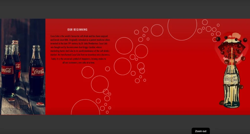
Coke’s branding guide starts by sharing its rich history and takes us to its beginnings.
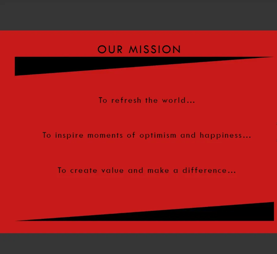
The Mission section is short and crisp, keeping the message light and fun-size. Absolutely on-brand.
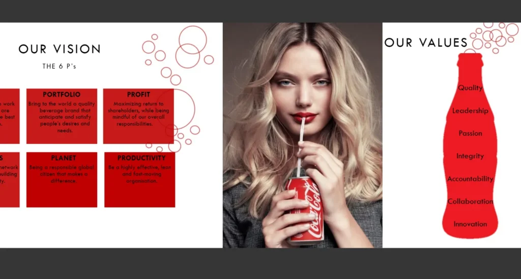
Do you see those bubbles accompanying the graphics? And brand values fit snugly inside Coke’s curvy bottle? Plus the model’s rich red lips?
These visual choices work as playful cues that strengthen the spirit of Coke in the style guide without being too direct.
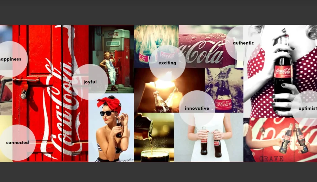
Coca-Cola uses imagery along with descriptive words to further explain the values that it stands for and embodies.
As you browse through the guide, you can see that the entire theme of Coke being a lively brand that is devoted to good times, friends, and togetherness comes through impeccably. The generous use of vibrant imagery does a lot of good, and not once the message becomes preachy or self-serving.
And that’s a hard thing to pull off in the Brand Story section of the guide. The mission, vision, and values part can become addled with a lot of text and not entice many people to pay it any mind.
But when you keep it concise, use single lines with bullet points, or help graphics tell your story, the message remains lithe and interesting, convincing people to give it a chance.
Let your logo guide your visual environment
For any brand, its logo design is its most-prized asset. It works as a centralized identity for the brand. Consumer segments who may not even engage with the brand often recognize the logo when it’s marketed properly.
Therefore, brands go to extreme lengths to ensure their consistent portrayal in the media through strong visual identities and logo designs that possess interesting characteristics. On print as well as digital. To make that happen, it’s necessary to create a logo design section that’s thorough and exhaustive.
Leave nothing to chance or personal interpretation. Lay down rules for size, context, layout, variations, spacing, colors, font, file formats, dos and don’ts, and everything else you can think of.
Branding guide example: Asana
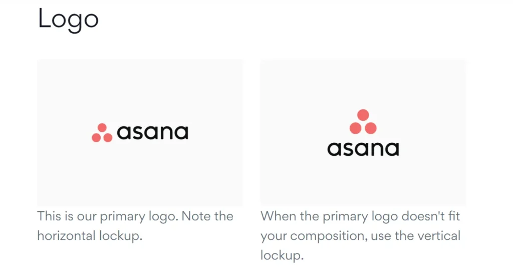
Clarify the usage rules around your logo variations. Show the lockup of your primary logo, then add the secondary variations explaining their contexts and backgrounds.
These rules could include things like using the vertical lockup when display spaces are cramped. Or using an icon-only version when the logo needs to be presented on app logo containers.
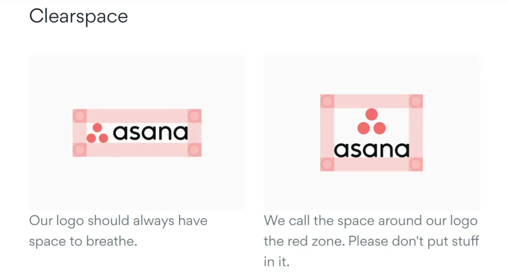
To ensure your logo is given enough room to breathe and exist, display the spacing rules of your logo.
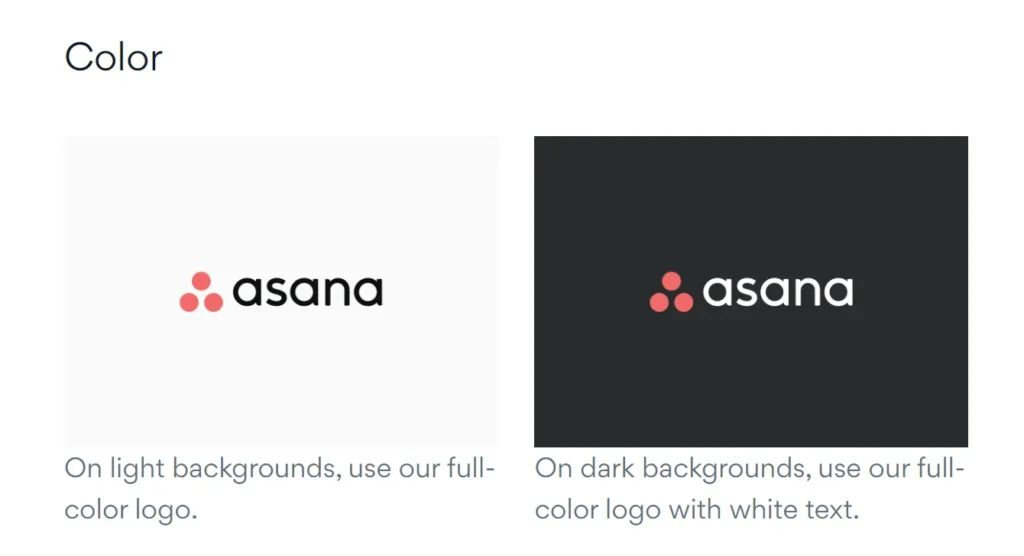
Not only do you need to specify rules around your logo colors in relation to its backgrounds, but you also have to outline your logo’s color palette.
It’s important to mention here that the color palette for your logo and your larger brand needs to be different. This difference must be complementary instead of contrasting to ensure the overall look and feel of the brand remains similar to each other.
In the color portion of your logo design, mention your primary and secondary logo colors. Include your color variations and add the relevant CMYK and RGB codes as well.
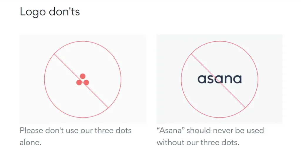
As important as it is to outline what to do, it’s equally important to tell users what not to. Add a dos and don’ts list for your logo design and usage.
In this example, Asana’s brand guide tells us not to use its iconic three dots alone without the wordmark, or use the wordmark without the three-dot symbol. Each must accompany the other for the logo to be complete and Asanas.
Construct your color palette
This section pertains to your brand’s core color palette. Ideally, brands do well with only a handful of colors in their palette. Not too few that your brand struggles to represent its range on the media, and not too many that your brand message becomes encumbered with the weight of all that color.
Striking that balance beautifully, we have Starbucks as an effective example.
Branding guide example: Starbucks
Though its color palette is larger than a ‘handful of colors’, it manages to use each one in complete harmony with its core green shades.
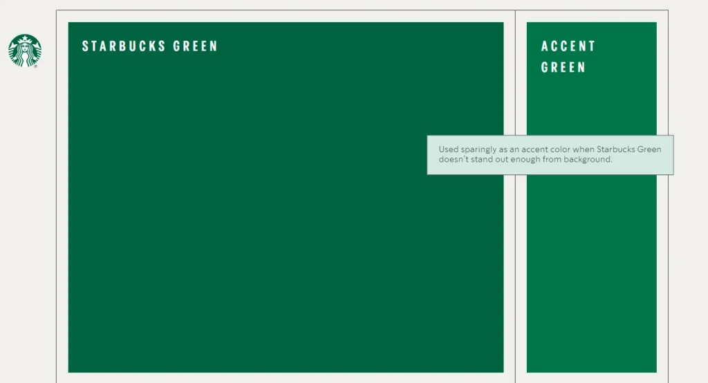
When you start talking about colors in the guide, start by sharing your primary and accent colors. Your accent color could be just one shade or may comprise 2-3 choices.
As you mention each color, include a color tile so people can actually see the color that you’re talking about. Additionally, include color codes for each shade that you include.
Major color codes that you must mention include RGB, CMYK, and HEX.
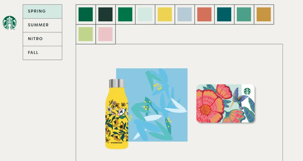
Here, Starbucks brand guide shows us its entire palette which not only includes primary and accent colors but has an entire seasonal chart with different colors for different seasons.
Needless to say, it gives Starbucks a massive range of color choices through which to present its brand’s various moods.
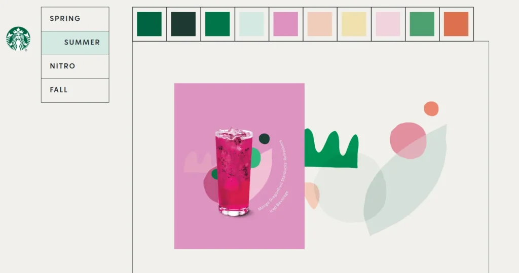
While these colors look incredibly vivacious, take a moment to understand that it’s an ambitious approach. Starbucks, a global brand with a massive footprint, can afford to have it, but as a new brand yourself, you’ll do well to start with only a few colors and add more as your brand grows.
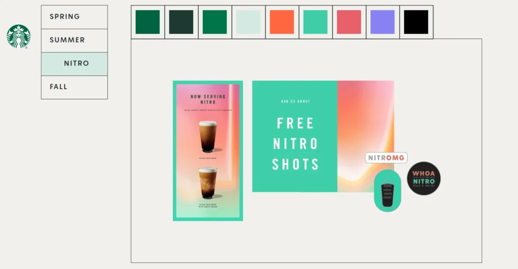
It’s also worthwhile to note that though the seasons are represented through strong color choices, the underlying, connecting colors are always Starbucks’ signature green and black.
Establish your typography system
One can argue that of the three core design elements — symbol, color, and type — it’s typography that plays the biggest functional role. Not only does it have to look good and be in harmony with other design elements, but it’s also the one that affects the design’s readability, too.
If you mess up your fonts, people can’t read what you are trying to say. It applies to your logo design, brand website, social media image templates, email newsletters, and more.
For this reason, make sure the rules around your brand typography are clear-cut and supplemented with generous examples. Clarify your brand’s primary and secondary font. Talk about typographic hierarchy so headings, subheadings, and body text can be easily distinguished.
As a general practice, there are no strict rules saying your brand must always talk in a custom font. Plenty of big brands use free Google fonts with huge success. Yet, if you decide to build a custom font for your brand, let the rules dictate its exact usage.
Branding guide example: TikTok
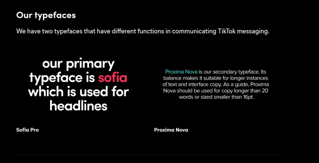
The TikTok brand guide starts its type section by introducing its brand fonts. One is only reserved for headings, while the other — Proxima Nova — is for body copy, but only when the copy is longer than 20 words or smaller than 16pt. Pretty specific rules, right?
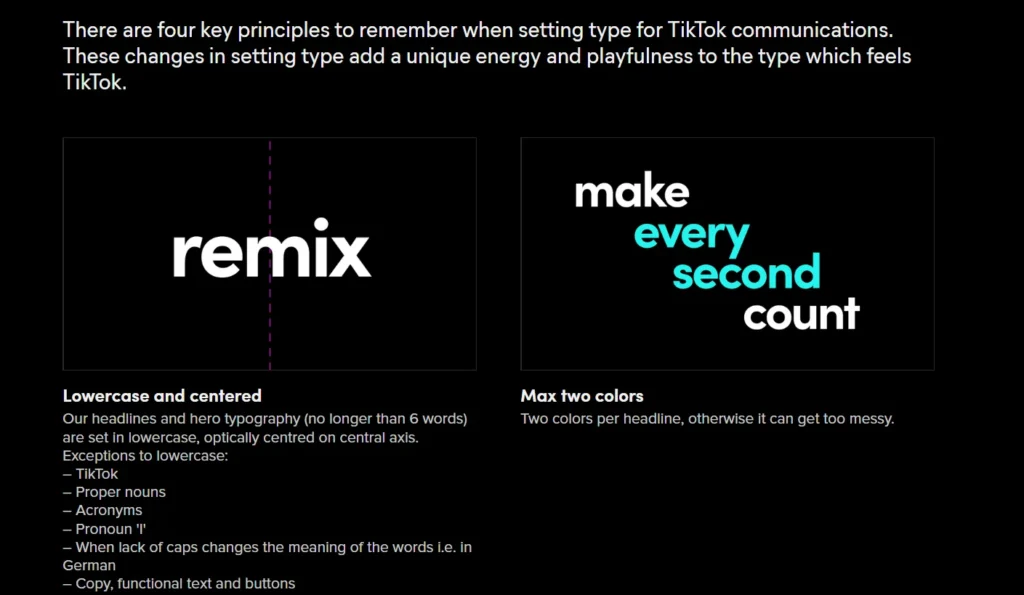
Here it tells us that TikTok headings cannot be longer than 6 words, must always be lowercase, must always be centered, and can only be presented in max two colors.
By being so precise and so descriptive, the brand ensures that it has complete control over how its brand communicates with the wider world.

Not leaving anything to chance, TikTok also has a 3-step graphic tutorial showing you how to compose the perfect headline for the brand.
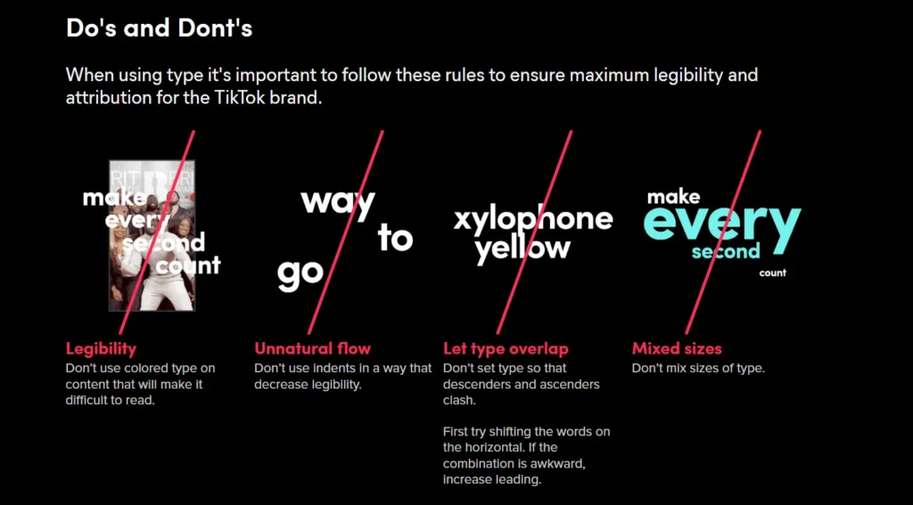
The guide ends its typography section with a simple dos and don’ts part giving you an insight into things not to do when communicating or presenting the TikTok brand to the public.
Define your brand voice
Your brand voice stems from your brand character and personality. Who you are as a brand comes through your voice, tone, and vocabulary — the words you use and how you use them.
Brands often struggle to find their voice, which is why it’s incredibly important to protect it through your brand guide once you find it and hone it to perfection.
In your guidebook, dedicate an entire section talking about your brand’s tone of voice. Share examples of how you talk. Include things like sentences that you will use and phrases that you won’t.
Share a list of words that you like and words that you do not. Explain the reasons so that when your content creators have to create interface copy or social media posts, they know how to get your voice right.
Branding guide example: Firefox
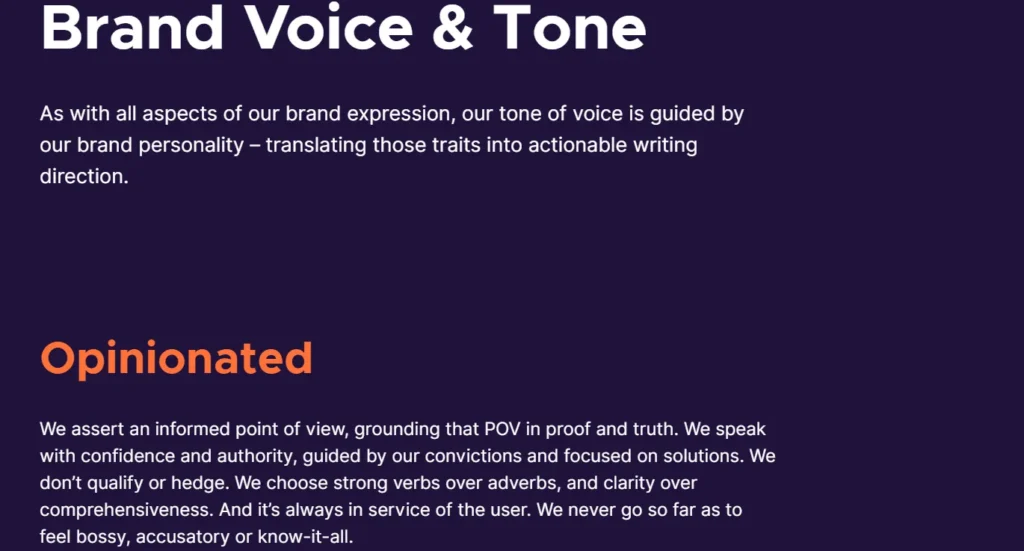
Firefox brand guide includes its Voice and Tone section under Brand Personality. It then uses its core personality tenets to talk about how it affects the brand voice.
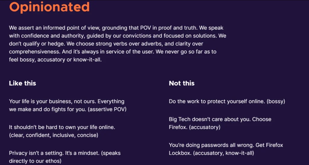
As an opinionated brand, it uses strong adverbs and prefers clarity over comprehensiveness. It strives to be assertive and confident, but never bossy.
Firefox — as a brand that has always championed user privacy — takes a tone that speaks to its ethos instead of being accusatory.
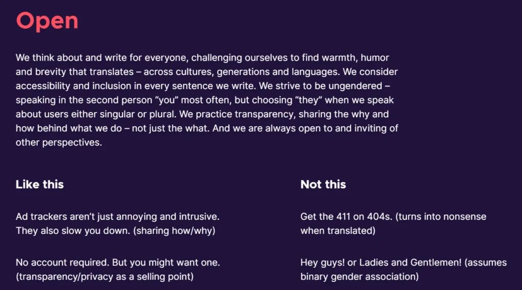
Since it’s also a brand advocating for openness and inclusivity, you can see from its tone that it shares its knowledge with you, telling you how and why.
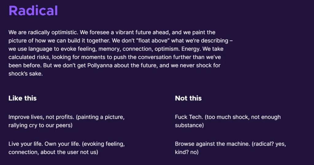
As a forward-thinking, optimistic, and radical brand, it uses a voice that evokes emotion, energy, and connection. Instead of going for superficial shock, it gives users a rallying cry to bring everyone together.
Outline imagery and photography guidelines
No brand can thrive without a social media presence that’s carefully crafted. Using high-quality imagery and other visuals is an important part of that strategy. That’s why an important thing to pay attention to is using clear guidelines about your brand’s use of photography, illustrations, motion graphics, icons, social media templates, videos, and more.
Start the section talking about your brand’s style and how it translates to the overall theme and connects with the audience. If there are different styles that overlap but still say the same thing, use descriptive words to define them, such as bold, visceral, and confident.
Give examples. Include rules about photo compositions, style, colors, captions, logo placement on pictures or videos and more. Let’s use Slack’s brand guide as an example.
Branding guide example: Slack
Slack helps companies from a wide area of business to work more efficiently. Its style is predominantly bold and modern.
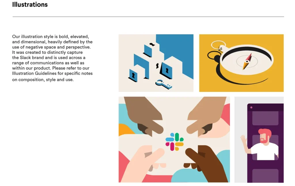
The brand guide uses a simple introductory para with multiple illustrations as examples to show the brand’s style in action. As you can see, the style heavily uses negative space and pays attention to perspective.
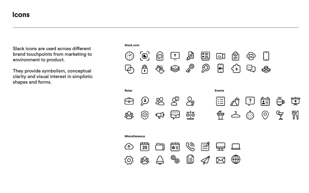
Since Slack uses a lot of iconography within its function, you can see an entire section dedicated to its usage. There are icons that are reserved for Slack’s marketing and product. Then there are icons that serve certain roles or are used only in certain events.
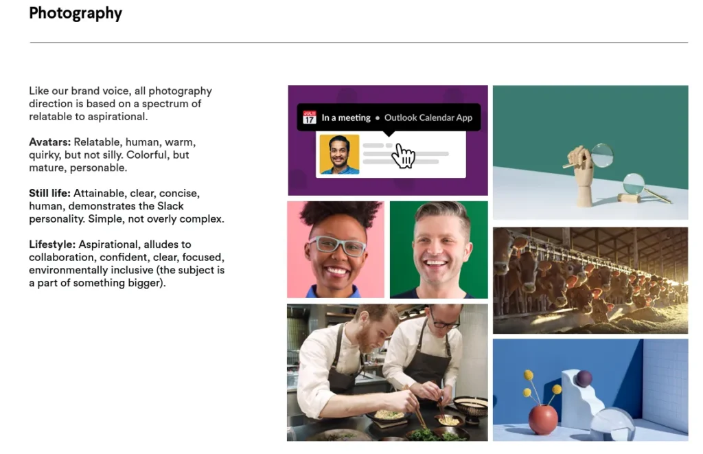
Slack’s photographic style relies heavily on avatars and clear, concise still-life photography. It’s simple, colorful, and mature.
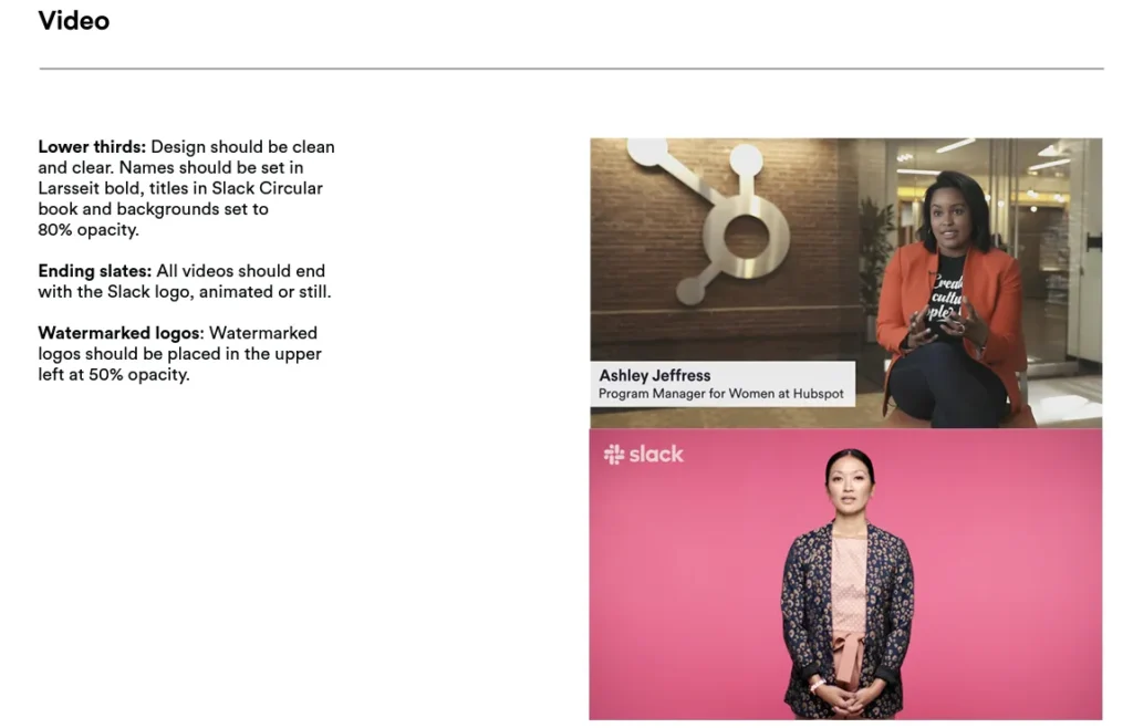
While the first few sections do not talk too much about rules, the section for Videos gives us a few standards to follow and maintain. For example, the videos will use the watermarked Slack logo placed in the upper left corner of the screen at 50% opacity.
Similarly, it also specifies rules on how to end the videos: with the Slack logo regardless of the fact that the video is animated or not.
Take this as an important lesson in building brand guides. There are things that you cannot strictly control. Photography is one of them. Therefore, it’s better to show a few examples. Describe your style with emotive words, and then leave the final decision with some room for free brand expression while staying true to its spirit.
What is the best way to share your brand guide?
Once you have prepared and compiled your brand guide, it’s important to share it in a format that’s easily accessible and easy to read. Some brands create and publish their guides in PDF, which isn’t too bad, but not the best either.
PDFs are static documents that you cannot change on the go or access everywhere.
Therefore, it’s better to share your brand guide in a digital format so everyone no matter where they are can easily access it on all their devices, and quickly make changes to their content after consulting with the guide.
The Takeaway
Branding guides are key to ensuring a consistent identity for the brand. As you can see, a lot goes into creating a brand guide that protects the brand and all its expressions. Therefore, once you build one, don’t let it go stale.
Keep updating it with all the new changes that a brand is going through and how its identity is responding to all those changes. As long as you treat your brand guide as an evolving and growing asset, it will never fail your brand.
